Hello readers and welcome to my second blog post, where I will be discussing the ways in which multimedia design can be both effective and accessible for all.
In this blog post, I will walk you through two experiences concurrently: my relationship with universal design and my application of design principles in the making of multimedia, namely an infographic.
Exploring Universal Design
My journey began with evaluating the inherent accessibility of my previous blog post for Module one (Blog Post 1), using a very cool web-based application called WAVE Accessibility Checker. This application allowed me to plug in my webpage, to which it outputted a report highlighting areas for improvement. Although I already had a good understanding of universal design walking into this course, I learned a lot from this exercise. Particularly, I learned how easy it can be to overlook accessibility, which alludes to the fact that we should always be asking ourselves “is this design universally accessible?”.
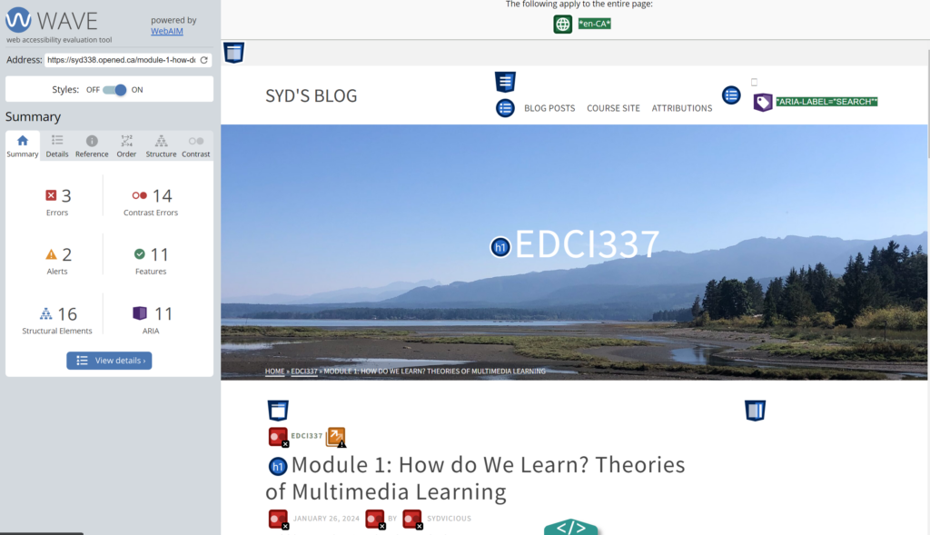
Figure 1. WAVE Accessibility Checker Report of Syd’s Module One Blog Post. This image is a screen capture of my WAVE Accessibility Checker report. It highlights that my webpage for my Module One blog post was lacking in contrast between some text and background, as well as it disrespected the hierarchy of headers by jumping ahead in the sequence.
Creating an Infographic
I carried the same question (is this design universally accessible?) in my pocket as I created my infographic (WIS Organizational Structure Infographic), along with many principles in mind. Specifically, I ensured to (1) use simple, legible text, (2) ensured enough contrast between the text and the background (something I overlooked when selecting a design for my blog website), (3) followed the flow of size hierarchy with my headings and sub-headings (an aspect my first blog post was lacking), (4) considered proximity, and (5) focused on alignment. Something that was challenging for me in this experience was sticking to only a few colours in an effort to limit my colour palette. Although this was difficulty, I was able to see in the finished product the way it was conducive to the accessible engagement of my design.
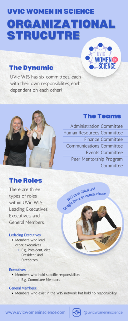
Figure 2. Infographic describing the structural organization of UVic Women in Science. This infographic outlines the organizational structure of UVic Women in Science (WIS), highlighting its dynamic composition of six committees, each with unique responsibilities essential for the group’s operation. The committees listed include Administration, Human Resources, Finance, Communications, Events, and the Peer Mentorship Program Committee. It further categorizes member roles within WIS into three types: Leading Executives, Executives, and General Members, detailing the hierarchical structure and specific responsibilities associated with each role. This framework supports WIS’s mission to foster inclusivity and promote women in STEM fields effectively.
All in all, I had fun with this module, as it allowed me the opportunity to better understand my own application of universal design throughout my multimedia creations, as well as put some design principles into practice.
Thank you for taking the time to read my blog post. If you enjoyed this disucssion, I welcome and encourage you to drop a comment below!
Hey Syd, great insight in your post for this module! I really like how you used contrast and colour in your design to help break up the different ideas, this made it very clear and easy to understand for me. I did however find the large amounts of text in different sizes to be slightly distracting, but I understand the difficulty of navigating the issue in the context of the content you were sharing. Great work, looking forward to the next post!